
Gnomes & Gnostalgia: Branding Rock City
September 9, 2025
While animations can showcase a brand’s visual evolution in mere seconds, the journey from old to new is anything but instant. The rollout of a new brand identity reflects months or years of strategy, iteration, and storytelling. And, in this case, lots of discussions about gnomes and (g)nostalgia.
When PGAV was selected to design the new brand identity for Rock City, the team was excited—and more than a little nervous. Rock City is an American icon, beloved by many, with a rich visual history, a unique story, and big plans for its future. Capturing all of that in a single visual identity would be no small task.
A Geological and Botanical Wonder
Rock City is one of those places you must see to believe. One-part natural wonder, one-part beloved roadside attraction, one-part enchanted adventure. Trails weave through giant rock formations and across suspended rope bridges, revealing breathtaking views, playful gnome sculptures, and an underground installation of Grimm’s fairytales in blacklight splendor. Each year, more than half a million people visit.
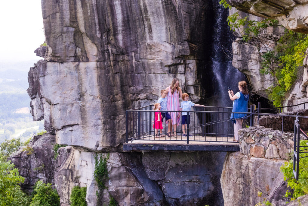
It’s a lot to take in, and that is by design. Rock City’s founders, the entrepreneur Garnet Carter and his visionary wife Frieda sought to create a rock garden to end all rock gardens. Frieda charted a trail around giant rock formations, adding plants and her beloved German statues of gnomes and fairytale creatures. Today, fifth-generation owner Doug Chapin and his team carry forth their tradition of creating a sense of wonder for all who visit.
See Rock City
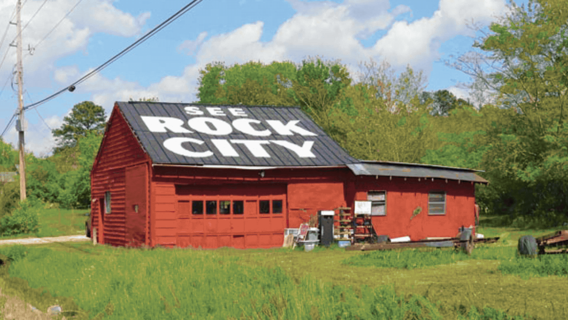
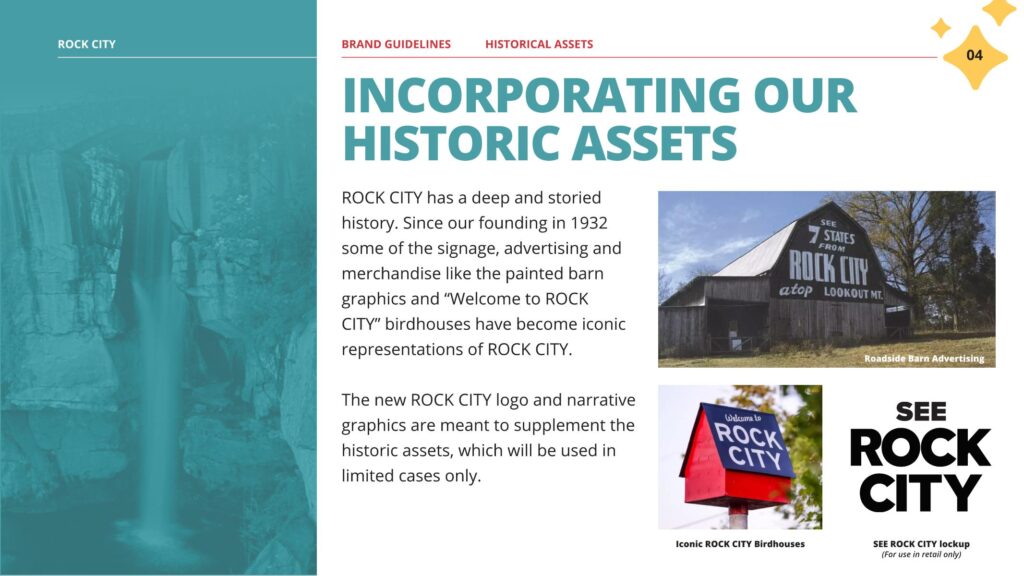
Since 1935, Rock City barns have stood as genuine highway Americana, their bold white-on-black signs compelling both snowbirds and Sunday drivers to “See Rock City.” Hand painted by a young sign painter named Clark Byers, the distinctive signs appeared as far north as Michigan and as far west as Texas. Soon, there were birdhouses to match the barns. Our brand work would need to take these into consideration.
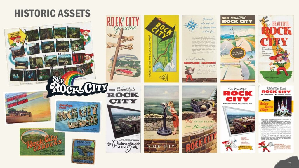
Besides the barns, Rock City had as a treasure trove of historic assets like postcards, brochures, and other printed ephemera produced by the destination over the years. Director of Brand Experience, Amanda Yates notes, “Our team loved visual range in these pieces, from the gorgeous illustrations to the range in type treatments to the gnomes popping up everywhere—it really spoke to the unique personality of Rock City. We sought to carry that playful spirit forward in our work.”
The Process: Strategy & Positioning
PGAV’s brand identity process consistently starts with an understanding of the guest: who is coming to the destination and why? Working with the Rock City team, PGAV mapped audience segments and key destination brand pillars—the building blocks for the brand strategy. In these meetings, one insight became clear: while legacy and storytelling were important drivers, they were not as important as fostering a sense of enchantment, natural wonder, and connection. Rock City is a place where memories are created across generations, and the new brand identity had to express that.
Next, existing brand assets were analyzed, doing a deep dive to understand current and future uses. While Rock City’s current brand served them for several years, it did not effectively communicate the range of experiences the destination offers. It also contained a lot of variation across assets.
The strategy became clear. The new Rock City brand needed to:
- Evoke a powerful emotional quality
- More clearly capture the experience
- Be unique to the market
- Represent the Brand Voice & Story
- Simplify aspects that no longer serve the brand
- Create a versatile system that works across different applications while honoring historic assets
With a strategy in place, the team turned to the logo design, studying typefaces, colors, and illustrative approaches aligned with the brand drivers.
The Process: Logo Options
In the initial logo study, a wide range of options were explored to prompt discussion with Rock City’s team. Should the logo place greater emphasis on the natural wonder pillar and the iconography of Lookout Mountain and its views? What about taglines?
Building on the barns and roadside attraction history, what does a “road sign” badge style do for us? ”These design rounds uncovered a direction that fuses the graphic punch of barn-style lettering with the nostalgic warmth of national park aesthetics—inviting, bold, and rooted in the playful spirit of mid-century roadside culture,” explained Graphic Designer Kyle Russell.
Should we lean into Rock City’s sense of enchantment with magical portals and, of course, gnomes?
Overall, the team sought to explore type and color options that felt both surprising and authentic to the brand voice.
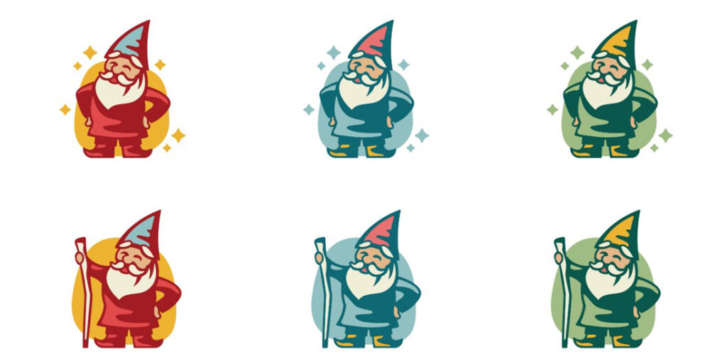
This first round generated a lot of good conversations with the Rock City team, which ultimately determined that the gnomes were an important visual element, and perhaps the strongest from an experiential storytelling standpoint. In fact, the gnomes were being developed separately into a whole family of characters representing different aspects of Rock City (more on that later).
Refining the Gnome
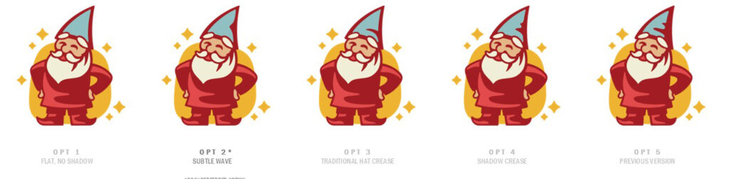
Round two explored what the gnomes could look like:
The team spent a good deal of time researching gnomes in order to distill them into their most iconic features. They must be short and stout, but not too short or too stout. Traditionally, they have a beard, but there are variations across folklore. A key distinction: in Germanic tradition, a gnome’s hat doesn’t cover its eyes; if it does, that’s not a gnome at all, but a Scandinavian “gonk.”
By the third round, two favorite logo directions had emerged. Jess Solomon, Senior Graphic Designer, reflects: “This round was a challenge as we worked toward finalizing our gnome character. Certain design choices kept shifting the impression—when he wore red, he felt too much like Santa, and if his hat was too pointy or his staff too tall, he started to resemble a wizard. Through simplifying, finessing, and carefully adjusting every detail, curve, and vector point, we were able to strike the right balance.”
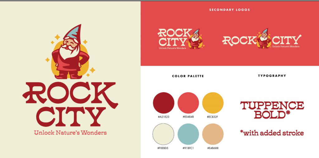
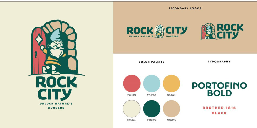
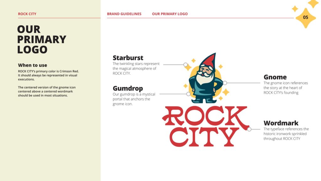
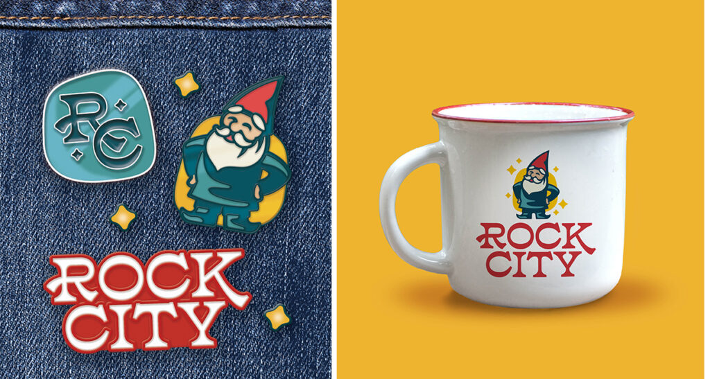
By Round Four, the selected gnome was polished into its final form. Colors were refined, shapes and shadows adjusted, and playful details—like gumdrops and stars—were buffed and shined. Additional lockups and a monogram were developed for flexible use.

Updating the Gnomenclature
With the final logo complete, PGAV documented the system in a comprehensive brand guide, complete with applications for signage, retail, and marketing.
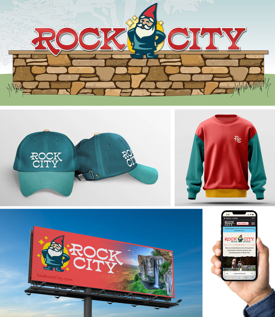
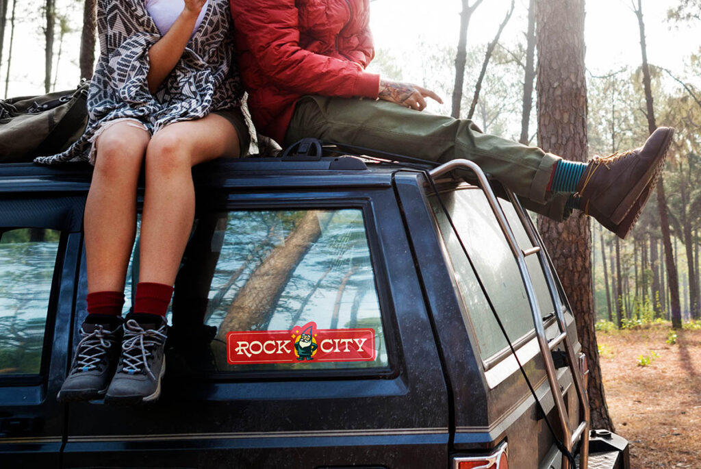
Rock City’s updated brand can now be found throughout the destination, across marketing materials, and on its redesigned website. The result is the product of a highly iterative, collaborative process with Rock City’s Innovation Team, whose vision was integral to the outcome.
“This visual rebrand represents our next chapter,” said Doug Chapin, owner and CEO. “It brings new life to the wonder that’s always been here, updating our look while inviting old friends, like our gnomes, to finally step into view.”
And the gnomes? Their story is just beginning. The next Destinology will dive into the character development process for Rock City’s gnomes.
Date
September 9, 2025
Categories
Tags